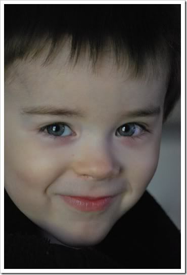
It's time for Fix It Friday again over at I ♥ Faces. They give us a photograph to edit - any way we want to. We post our edits in our blog with a link to I ♥ Faces. Here is the photo they gave us to work on this week:

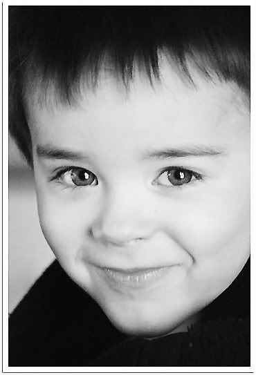
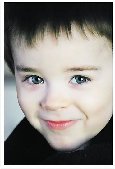
Once again I started by reversing the shot. I played around in photoshopexpress.com, then did some work in photoshop CS3. I even sent my edits through Picasa 3. I'm not totally satisfied with what I got and may work on it some more. Here is my first edit:

I like the black and white version, but I also like it with a touch of color.

I didn't figure I could go wrong with such a cute little fellow as my model :O). Let me know what you think - any suggestions to make it better? I want to learn how to get better results. Thanks :O). If you want to head on over to I ♥ Faces and check out everyone elses' edits - go here.


12 comments:
i like the B&W, too, but the one with a little color really shows the eyes nice and just the right amount of color in the lips. Nice job of smoothing, too
Great edits... i like how you turned the photo around, so it's different
Thanks for all your comments.. I'll have to email you the "tutorial" to help make eyes pop, it's real easy!
I think your black and white is fabulous, but the other one is great too. Nice touch flipping the image. :)
I like the one with a touch of color just a bit better... I like seeing the color in his eyes! I didn't even think about flipping the picture, but think it adds to the fix... Thanks for your comments!
I like the eyes and the way your fliped the photo.
Wow...thanks for the comment. I think I may still be cyber blushing!! :) Love the black and white and the fact that you mirrored the image just to give it a different perspective. on another note, I see you have a Compassion child. I have had a little girl named Evaline for the past 7 years. I think it would be amazing to go visit her someday!
I like both edits, but the one with w little color is my favorite. Just right.
Great edits! That black and white one is awesome :) Good job!
Sorry that link isn't working. The address is:
http://digitalphotographyformoms.net/
I really like that you turned the photo around & I like the B&W the best. I don't know what to critique, I think you did a fantastic job! :)
I love that you reversed the photo!! The last edit is perfect! I love it!
I like that you flipped the image. Great idea.
Thanks for the visit. I really like the black and white...his eyes really pop.
Post a Comment